WordPress Themes, Styles and Basic Terminology
한국어로 읽기 →
Overview
This post is meant to make it easy to look things up: when you run into something you don’t know in a later post, you can come back here and find it in the Table of contents on the right.
You don’t need to read it from start to finish. Just check the Theme and Style sections, and look up the rest whenever something unfamiliar comes up in a later post. (I’ll be adding links)
Also, the contents here will be updated periodically as needed.
Theme
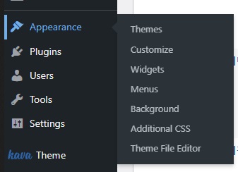
On the main WordPress admin page, in the left sidebar, you’ll see Apperance – Themes.
In the Korean version, Apperance seems to be shown as ‘외모’ (appearance/looks), but when I used it in Korean the translation was actually harder to understand, so I use the English version and that’s why it shows up like that.
So what is a theme? WordPress isn’t a platform like Naver Blog. It’s a tool built to let you create websites more easily than the traditional way.
So installing WordPress doesn’t mean you get a ready-made frame where you can just post articles like on Naver Blog. The user has to build everything up piece by piece.
Building everything from scratch could be tough, right? You can think of a theme as the thing that does that for you.
A theme provides a basic picture frame, so to speak. You can download a theme you like and plug it in, and from there you can also modify it to your taste.
Even a complete beginner can build a reasonably functional website and post articles just by applying a theme. The method the YouTuber ‘로알남’ (Roalnam) explains for WordPress also uses a theme.
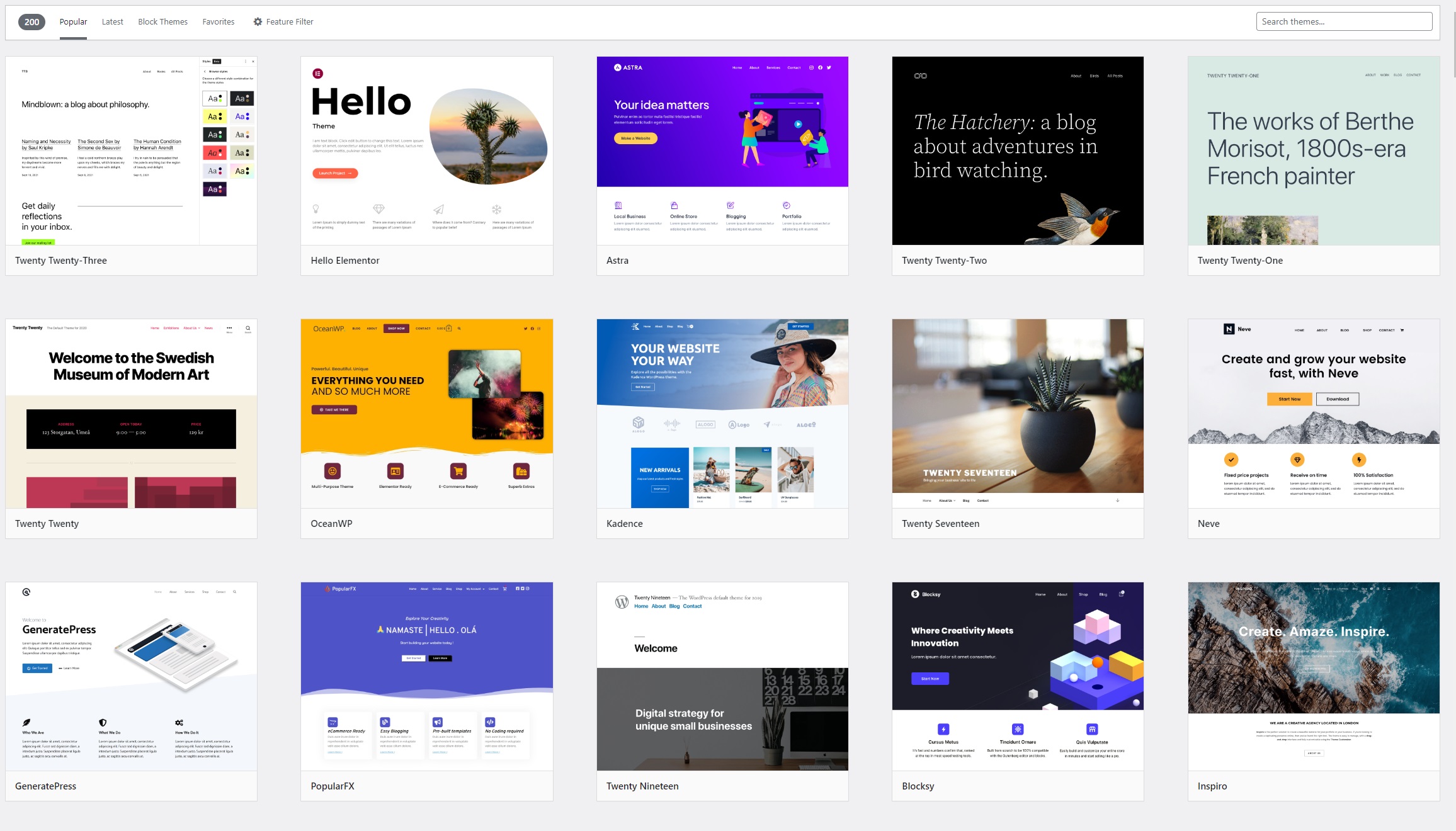
If you press add new under Themes, you can download and apply lots of themes like this. You can search in the top right, and if you already have a theme you can upload it and use it too.
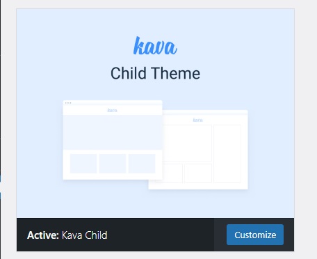
In my case, I don’t really use a theme as such. I enjoy building everything up from the bare ground, so I use the Kava Child Theme that comes bundled with Crocoblock.
Don’t worry if you’re using a different theme than me. The basic usage is all the same, and the only difference is the initial frame, so if you’re going to customize it to your taste anyway, there’s not much difference.
See the Customize button? It’s the theme editing button where you can set the theme’s basic colors, text format, site logo and so on. Let’s take a look.
Theme Customization (Customize)
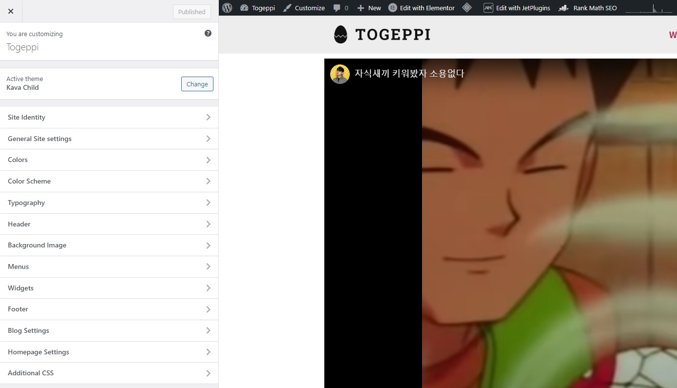
This is the Customize entry screen for my Togeppi blog. Let me briefly explain each item.
(1) Site Identity
You can set the site’s title and tagline.
(2) General Site settings
You can set the favicon, page layout, breadcrumbs, the To top button and so on.
For page layout I set it to Full width, but do whatever you like. This setting can also be changed one by one later when editing pages, so you don’t necessarily have to touch it.
I didn’t use the breadcrumbs feature here.
The To top button appears when you scroll down the page and sends you back to the very top. Add it if you like. If you want to change how the button looks, refer to the ‘Style’ section described below.
(3) Colors / Colre Scheme
You can apply the page’s background color, the basic text color, the color applied to links and so on.
However, since these can be set individually as you build your pages, there’s no great need to touch them, but if a widget displays a default color that I can’t set myself, you can change it here and it’ll apply.
(4) Typography
You can specify the size, font weight, width, spacing and so on for each of the text formats H1 ~ H6.
You can also specify buttons and body text, but I only set H1~H6 separately. In this post too, I use H1 and H2 for headings and H5 for the content.
Rather than setting it up from the start, it’s easier to adjust later while checking how things display as you write posts.
(5) Homepage Setting
You can specify which page will be your website’s homepage. The homepage is also the main page you can send people to when they click the logo.
The items not mentioned above, like Header / Background Image / Menus / Widgets, will be set up separately anyway, so you don’t need to configure them here; just check them as needed.
Also, since this content was written based on the Kave Child theme, the settings differ from theme to theme. Please keep that in mind.
Detailed Widget Settings
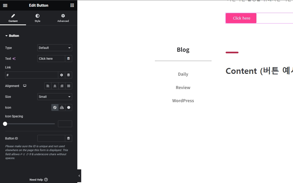
There are lots of kinds of widgets, right? The screenshot above is the Button widget, and there are many others like text, image, icon and so on. When it comes to applying styles to these various widgets, the framework is more or less similar. That’s what I want to explain.
For a basic explanation, the button widget seems the most convenient. It’s used a lot too.
Content
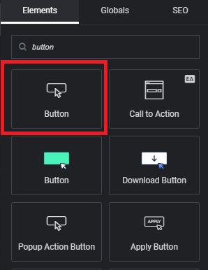
If you search for button in the left sidebar, several come up. I normally use the Crocoblock button below the one I’ve marked, but since some people won’t be using it, I’ll explain using the default WordPress button.
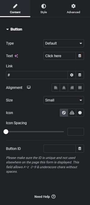
This is the Content panel that appears first when you click the button widget.
You can just leave Type at its default.
(1) Text
You can change the button’s label.
(2) Link
This lets the button go to the link you set when clicked. With the default # that’s filled in, nothing happens. # is also used later in menu settings.
Here you can link to a page within your own website, or to another site. To add a link to another site, just copy and paste the URL and you’re done. The same goes for links within your own website, but if you know the slug, just entering /slug/ is enough to make it go to that page.
On the right there’s a settings button and a pancake-shaped button. Let’s look at the settings button first.
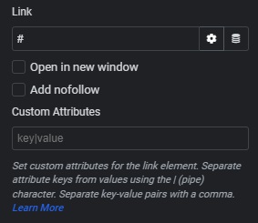
Press the gear-shaped settings button (Link Options) and it drops down like that. Link is the same as explained above, so let me explain the two items below it.
-
Open in new window
If you enable the Open in new window toggle, then when you press this button to go to the address entered in Link, instead of leaving the page you’re currently viewing, it opens that page in a new window.
This may actually be an important point for SEO, which you’ll study later (you don’t need to know this at the current stage). To put it simply, SEO factors in how long people stay on a page, so if you open links in a new window the original page stays open, which is good for your SEO score. But if you think about ad revenue like Google Adsense, these days there are quite a few websites where you can’t see the content when you enter a page unless you view an ad. To see the content you have no choice but to watch the ad, and since you can’t get this semi-forced ad effect, there’s a downside in terms of revenue.
-
Add nofollow
This feature isn’t particularly important either, and you don’t need to know it at the current stage. It relates to the SEO I mentioned earlier,
and briefly, when you link to another page and people visit it, that other page ends up gaining visitors, which affects that page’s SEO score.
If you enable this feature, a nofollow attribute is attached to the link and it isn’t counted as a visitor. So it won’t affect SEO.
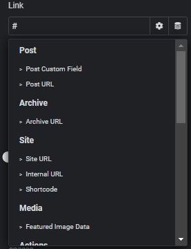
This is what it looks like when you click the pancake-shaped button (Dynamic tags).
Honestly, at first I found this feature too difficult and confusing so I didn’t use it much, but the more familiar you get, the more convenient it becomes. You don’t need to know it at this stage. There’s rarely any need to apply it to a button anyway!
Both Crocoblock’s JetEngine and Elementor have this Dynamic feature, and you can think of it as something used mainly when you need to pull in some data.
For example, say you’ve written a post and want to display the title within the content. You entered the title when writing the post, but to display it inside the content you’d have to write it again as text.
But writing it as text means that when you write another post, you’d have to type yet another title as text for it to show, and this feature kind of takes care of all that at once.
For example, if you set it up to fetch the post title through the Dynamic feature, then no matter which post it is, it pulls whatever is set as the Title in that post’s info and displays it. In a word, the Dynamic feature is great for building a frame to use like a theme.
If you click Post URL in the screenshot above and set it, it grabs the URL of the post you’re currently viewing and links to it.
(3) Alignment
You get this one without an explanation, right? It’s the button that decides which way to align. I’ll skip the size field too.
(4) Icon
You can put an icon in front of the button label, and this is where you set it. If you delete the whole label and set only an icon, you get a button with just the icon.
The Icon Spacing below it sets the distance between the icon and the text.
Now, to make everything above easier to understand as a whole, I’ll actually build buttons and show them along with their settings.
Because of the color settings in the Theme customize I explained above, my buttons are pink by default. Keep that in mind.
If you click the buttons, they actually navigate exactly as set in the screenshot above each button!

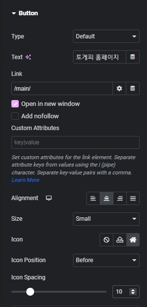
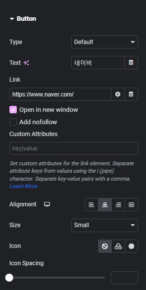
Style
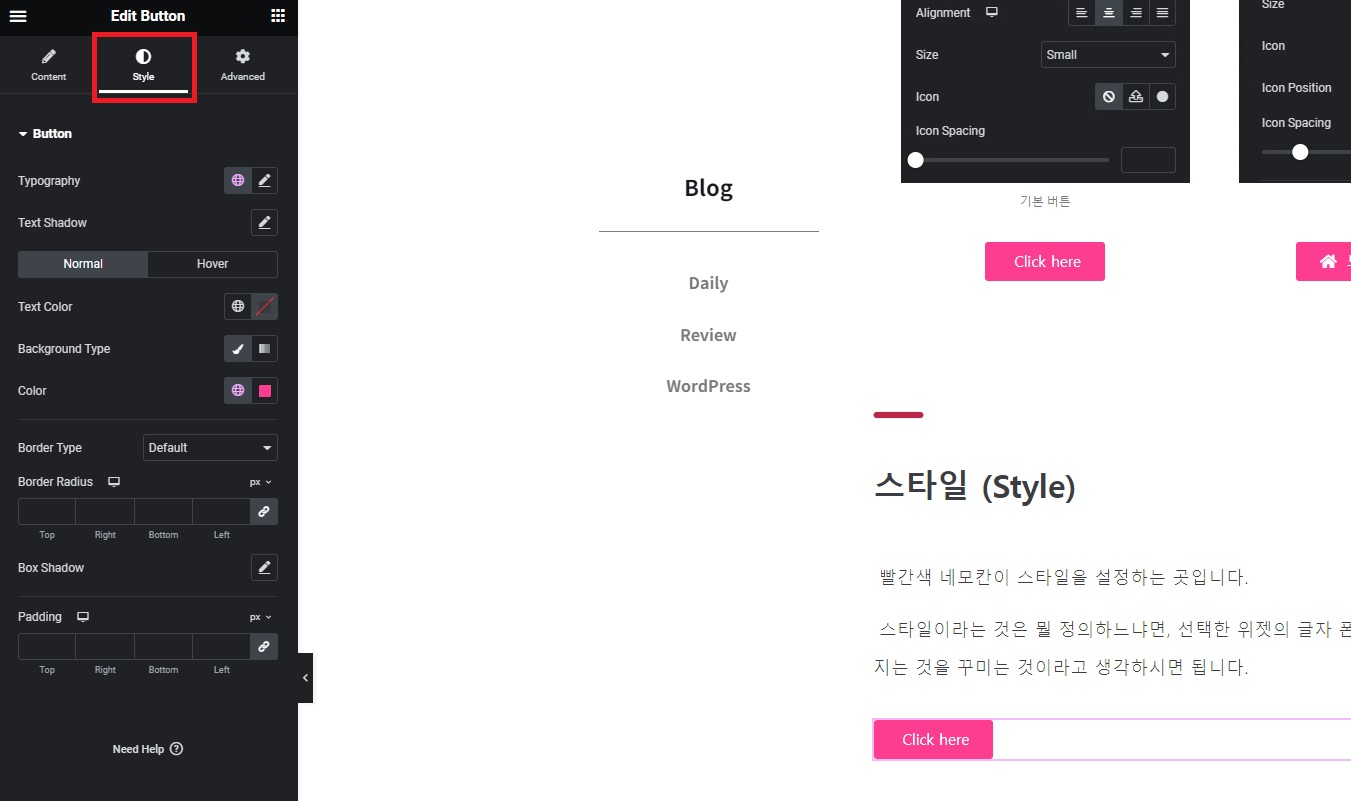
The red box is where you set the style.
What style defines is the decoration of everything visible on the selected widget: the font, color, size, background, top/bottom width and spacing, border and so on.
I’ll explain style using the button widget as well, like above.
(1) Typography
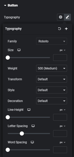
-
Family : Sets the font.
-
Size : Sets the text size.
-
Weight : Sets the text thickness.
-
Transform : Sets upper/lower case.
-
Style : Sets the text slant (italics).
-
Decoration : Lets you add a straight line to the text (underline etc.).
-
Line-Height : Adjusts the vertical spacing of the text.
-
Letter Spacing : Adjusts the horizontal spacing letter by letter.
-
Word Spacing : Adjusts the horizontal spacing word by word.
The difference between Letter Spacing and Word Spacing can be a bit confusing, but if you look at the actual applied examples below, it’ll be easy to understand.
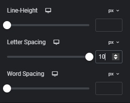
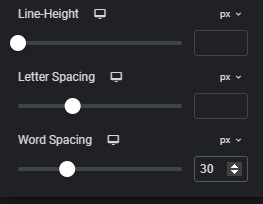
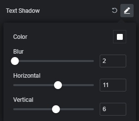
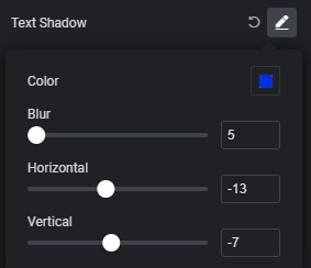
(2) Text Shadow
It’s a feature I don’t use much, but it adds a shadow effect behind the text. See the buttons below.
It depends on the settings, but I’ll say up front that I went overboard with the effect to show a clear difference.
(3) Normal / Hover
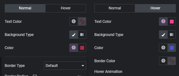
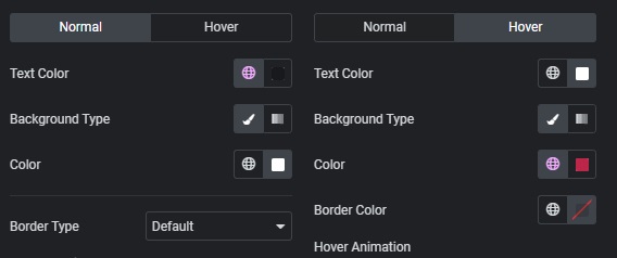
You’ve often seen a button change color when you move your mouse over it, giving you that “oh, this button works” feeling, right? This is where you set that.
Hover usually refers to mouse hover, and a helicopter flying in place is also called hovering. When the mouse is over a button, that’s called Hover.
Normal is the setting for how the button is displayed when you’re not touching it, and Hover sets how it changes when the mouse is over the button.
-
Text Color : Sets the text color.
-
Background Type : Sets whether the background color is a solid color or a gradient.
-
Color : A field that appears when you set Background; it sets the Background color.
-
Boarder Color : Sets the border color when there’s a border (Boader).
-
Hover animation : Sets the effect on Hover.
Now take a look at the buttons set up below and see what effects they have.
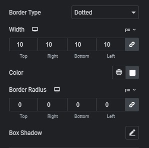
(4) Boarder
Boarder came up briefly above haha, and simply put, it’s the border (outline).
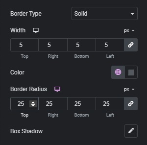
It sets the border of the widget in question. It’s not hard.
-
Boarder type : Sets how the border is drawn. You can choose a solid line, dotted line and so on.
-
Width : Sets the thickness of the border.
-
Border Radius : A value that makes the corners of the border rounded or angular.
-
Box shadow : Similar to the shadow feature explained above.
Check the differences with the buttons set up below.
(5) Padding
A new concept appears. When you hear padding, you might think of the padded jackets you wear in winter. Considering that padding actually means stuffing, the meaning is the same.
You can think of padding as a feature that adds space inside the widget’s border.
There’s a setting called Margin that comes up later, and it’s so similar to this one that I got them mixed up a lot at first. This isn’t an exactly accurate way to put it, but in my case I mainly use Padding to make a widget bulkier and Margin to make it smaller.
Now, seeing is believing, so check it out with the buttons below.
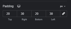
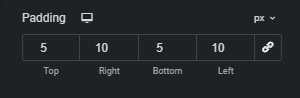
Can you feel the difference?
The px next to the number is a setting for whether you adjust in pixel units or as a percentage of the total size.
The chain-shaped feature is, in a word, a SYNC feature. Car air conditioners have a sync function for the passenger and driver seats too, right? If you enable that button and then edit, the values for Top, botton, right and left are all set to the same number and adjusted together.
And with that, the explanation of the Button widget’s Style settings is finished.
Advanced
-Content to be added-
